XINTIANDI STYLE II is a shopping mall focusing on international and domestic fashion design and arts. To cater to the lifestyle-focused preferences of the growing young premium clientele, XINTIANDI STYLE II proposed a rebranding strategy that emphasizes realness, recycling, and sustainability.
XINTIANDI STYLE II, Branding, 2021
⇨ Visual Identity, Creative Strategy, Poster Design, Pictogram Design
⇨ Visual Identity, Creative Strategy, Poster Design, Pictogram Design

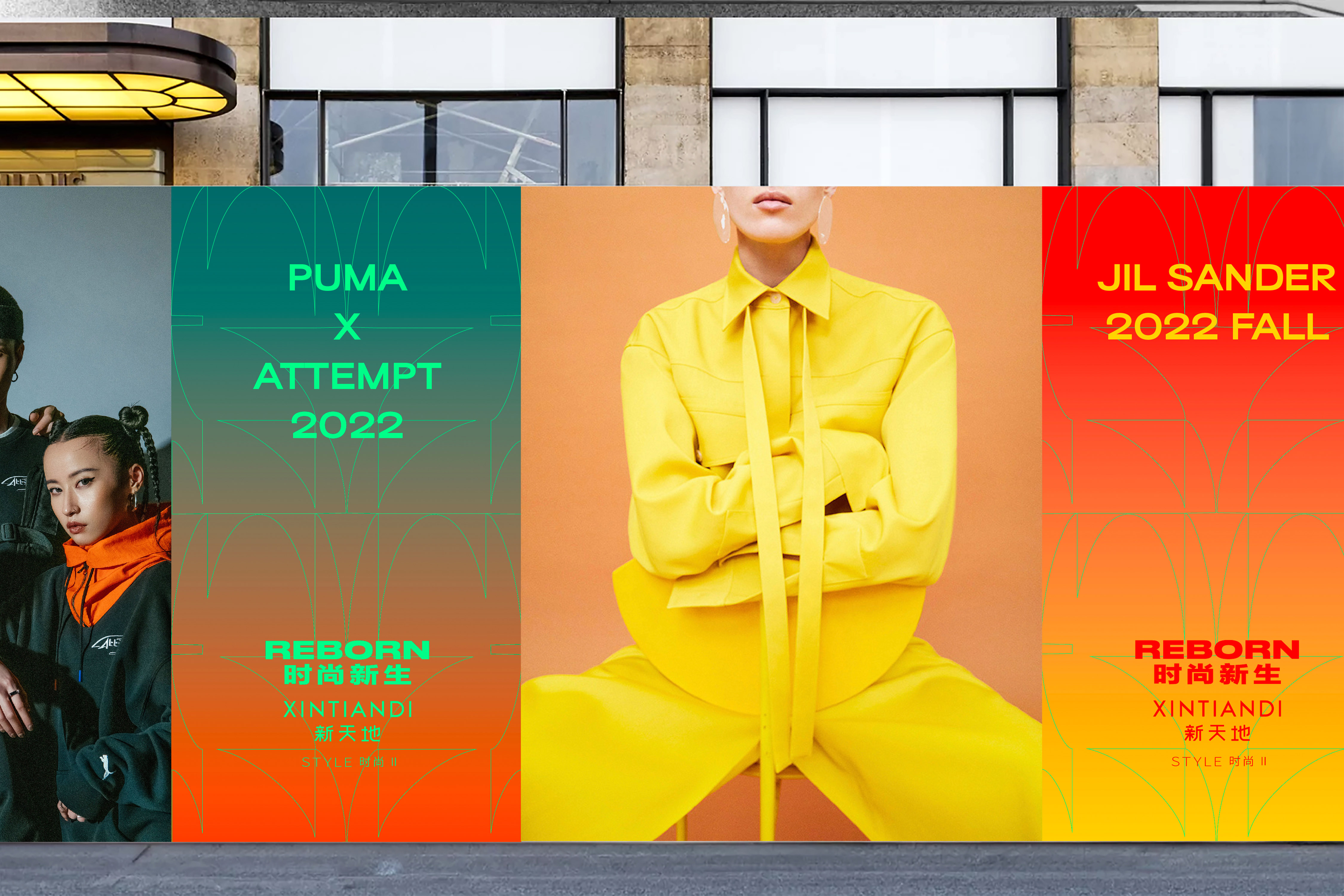
The visual identity is tightly connected with the concept of "raw, real, naked", taking the color palette as an example, silver represents concrete, red represents creative energy, and green echoes nature. On the graphic design side, we also utilized treatments from organic to rough, to express different moods.
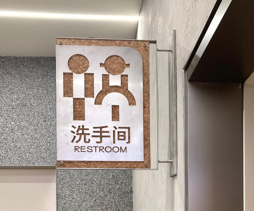
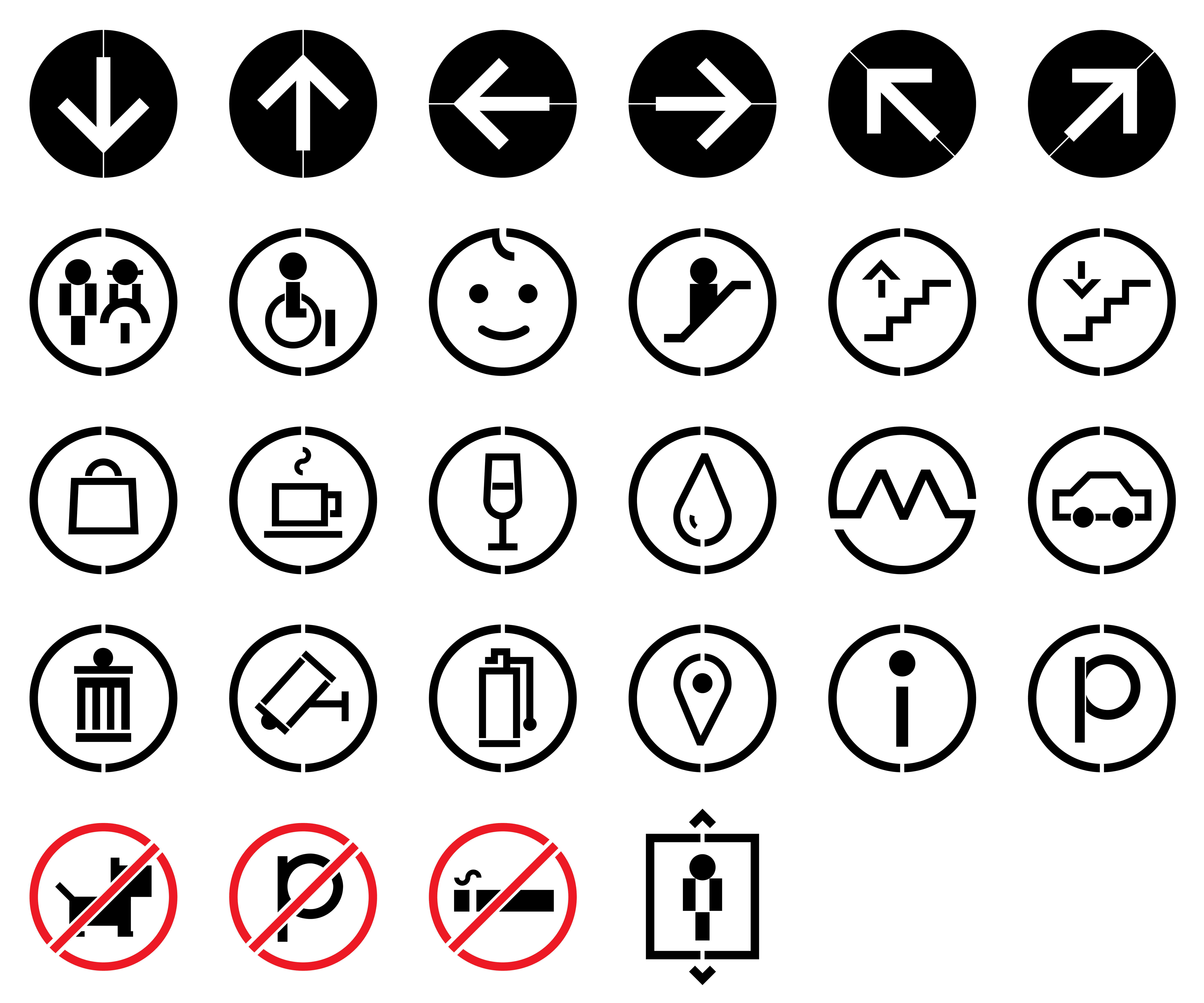
I collaborated with the team on creative strategy and visual identity and was individually responsible for creating a series of posters, pictogram icons, and the layout of signage.
I collaborated with the team on creative strategy and visual identity and was individually responsible for creating a series of posters, pictogram icons, and the layout of signage.
For the pictogram icons, we combined the circles and the rectangles, the soft and rigid shapes to resonate with the space. And integrating a bit of playfulness as well as modernity into the signage system.


Inspired by the reflection relationship between "S" and "2", this pair is chosen to create multiple layouts and patterns as the super symbol.
dongqi Creative Team
Director: Yuan Yuan
Designer: Yiting Zhu, Huiyang Yu
Director: Yuan Yuan
Designer: Yiting Zhu, Huiyang Yu