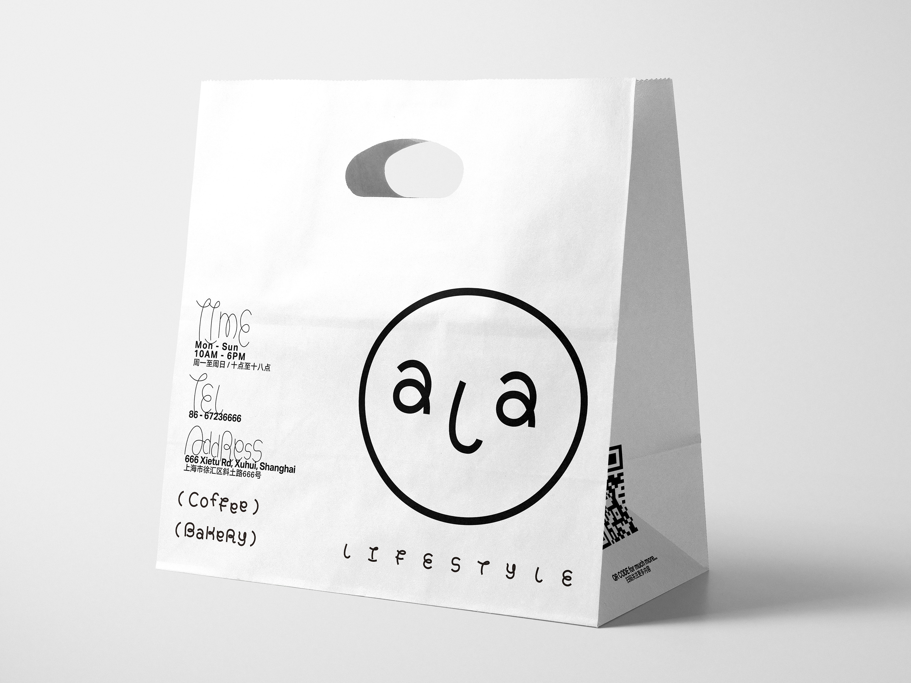
“ala” is a word that means my... (our...) in the Shanghai dialect. The ala cafe and bakery hopes to build a relaxed experience for consumers. I applied a stretched font to represent the floating milk foam and the fluffy bread.
ala, Branding, 2021
⇨ Visual Identity, Creative Strategy, Editorial Design
Nomination, Student Identity, Hiiibrand Awards 2021
⇨ Visual Identity, Creative Strategy, Editorial Design
Nomination, Student Identity, Hiiibrand Awards 2021


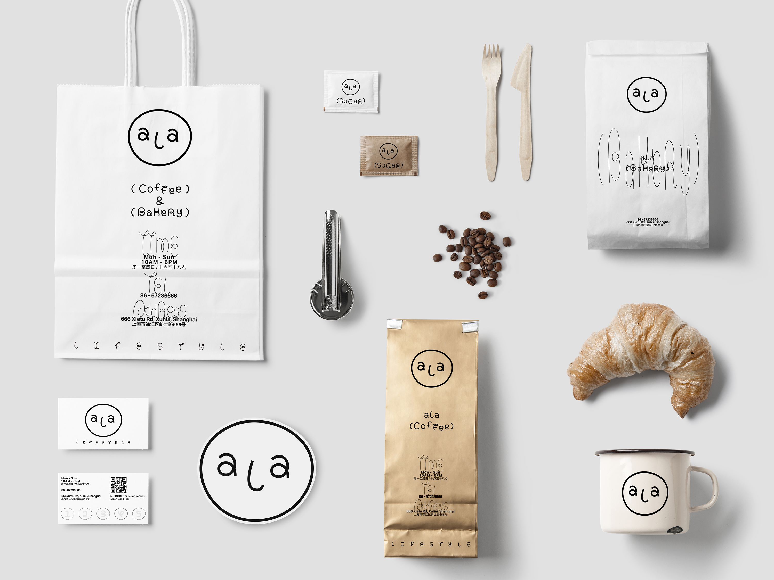
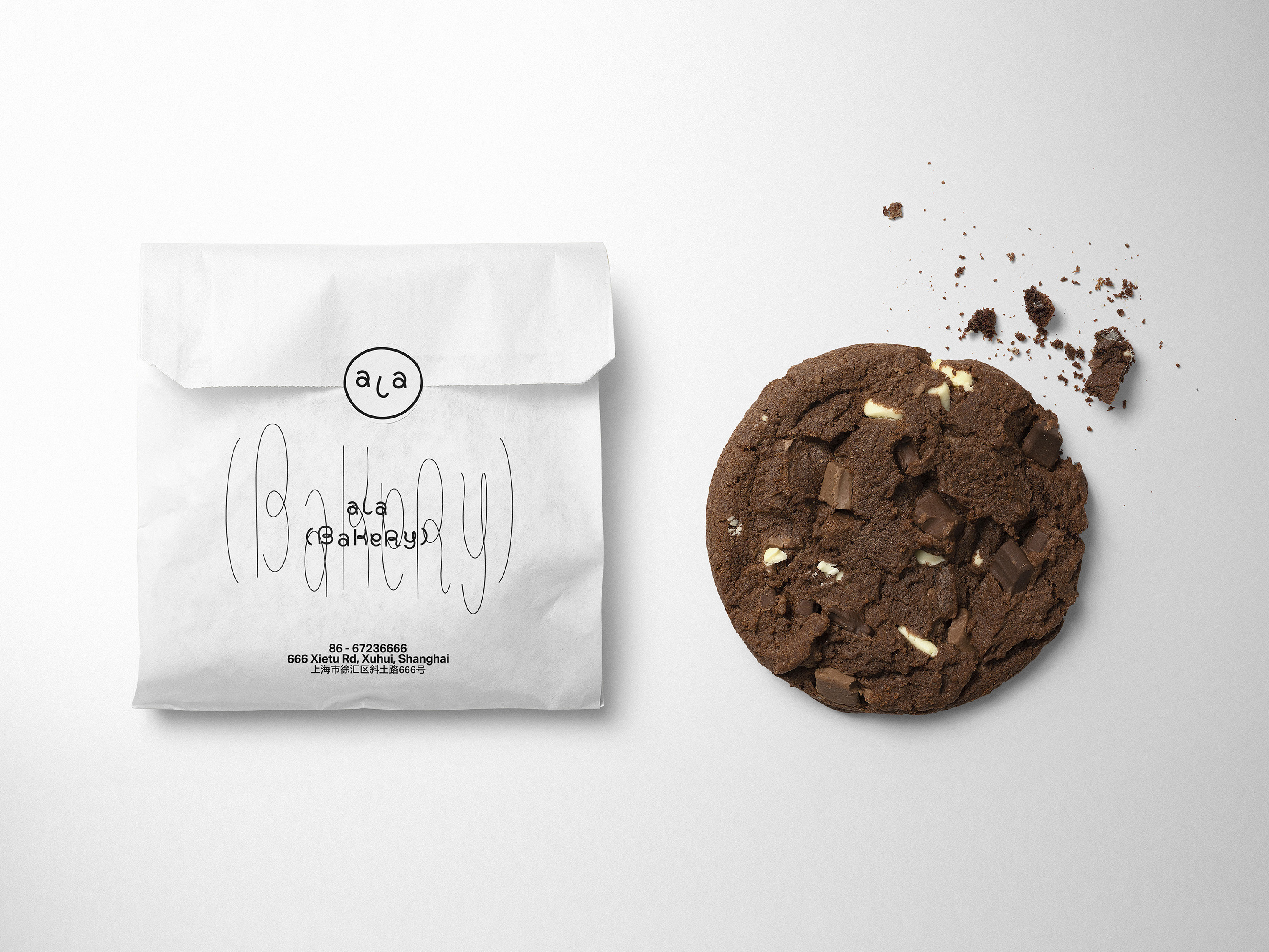
Through a flexible layout system, the visual identity could be adapted to various mediums.