too young city is a retail warehouse beauty brand that targets to provide products with clear ingredients. We used the font Space Mono to represent their scientific spirit.
tooyoungcity, Branding, 2021
⇨ Visual Identity, Creative Strategy, Editorial Design
⇨ Visual Identity, Creative Strategy, Editorial Design
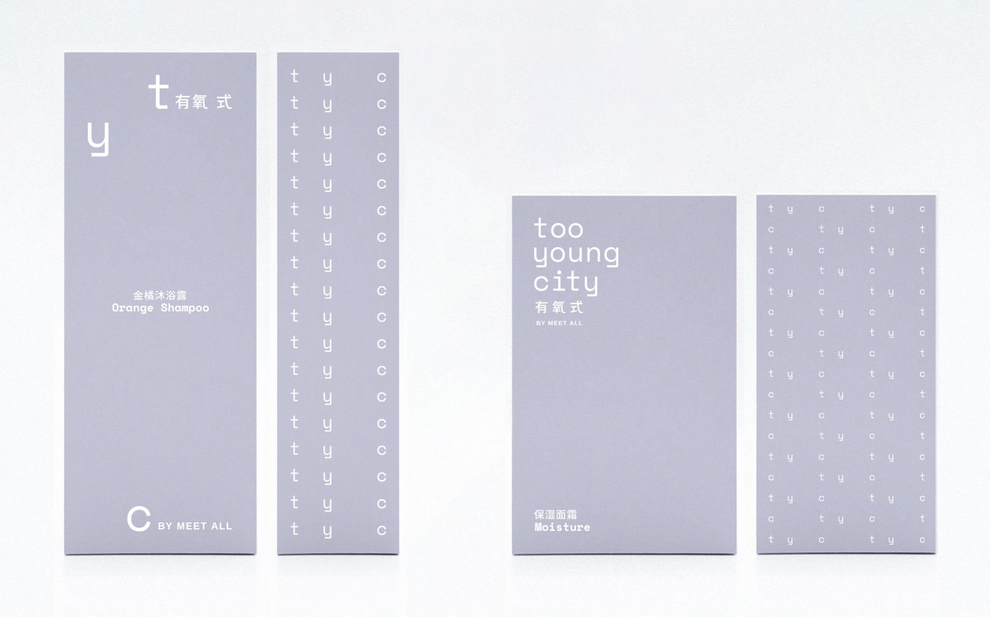
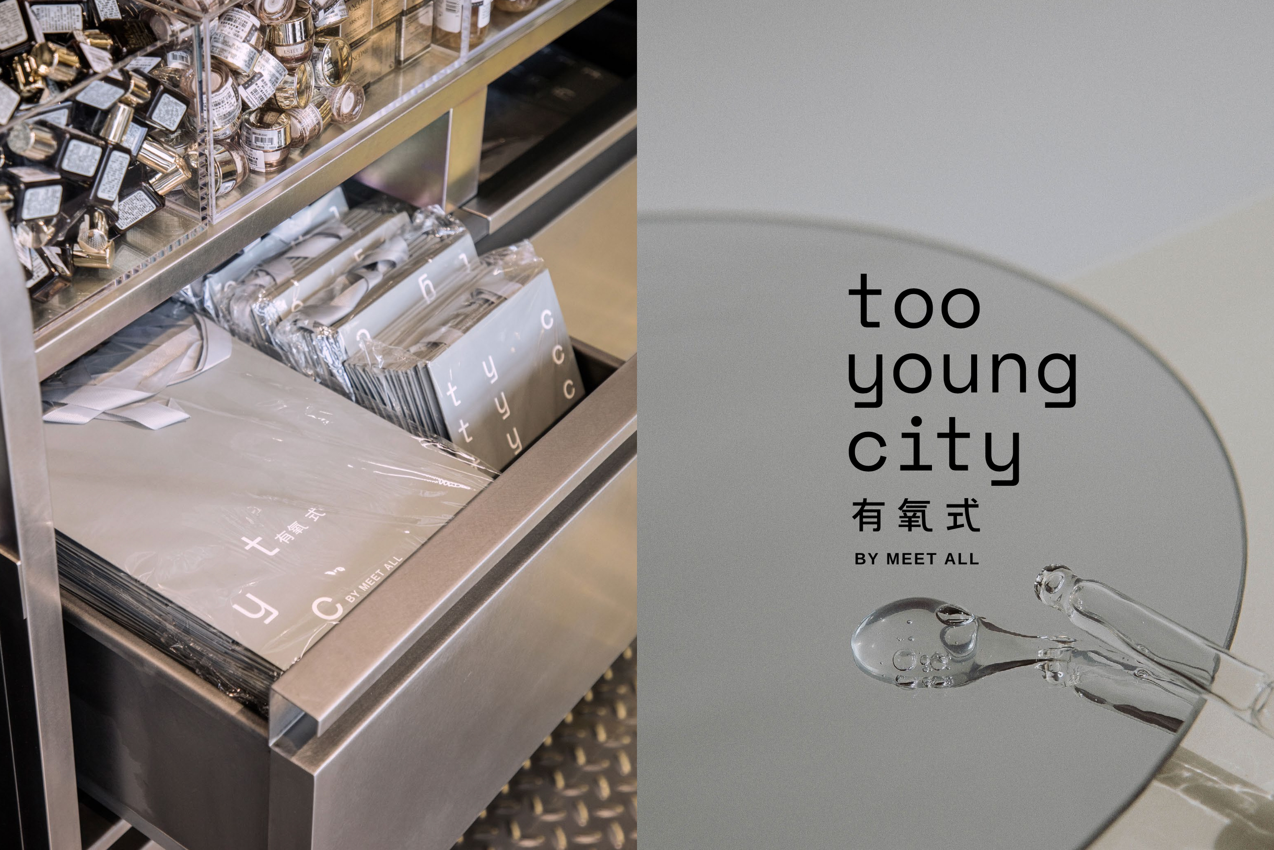
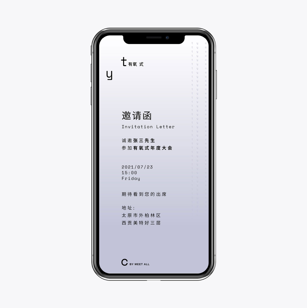
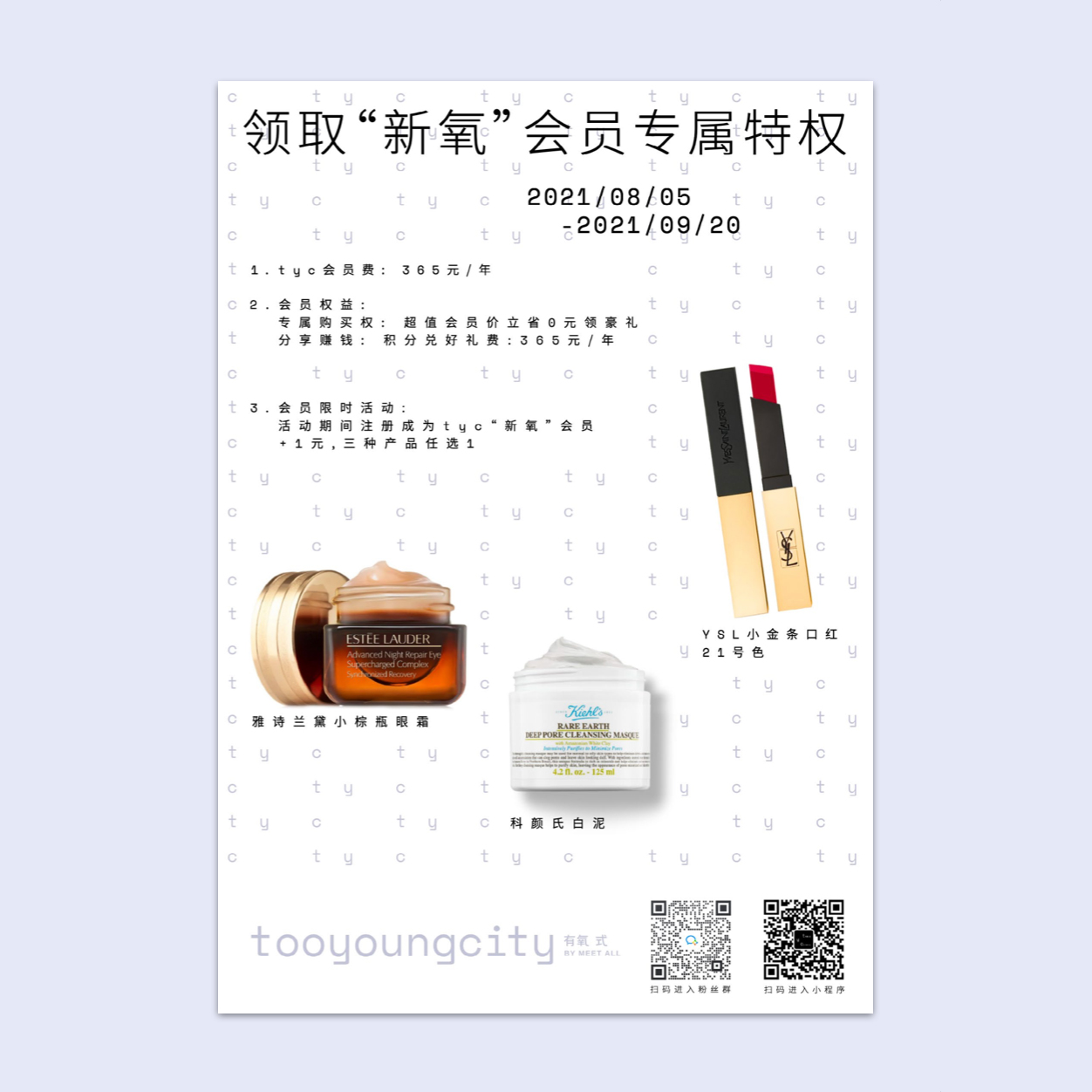
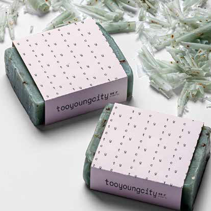
The logo system is extended to a flexible pattern, which enriches the brand’s visual identity on products.
The pattern can be widely used as the background, watermark, or visual graphic, from digital to print, and the in-between space among the matrix works as the baseline of various content.
dongqi Creative Team
Director: Yuan Yuan
Designer: Cher Liu, Yiting Zhu, Huiyang Yu
Director: Yuan Yuan
Designer: Cher Liu, Yiting Zhu, Huiyang Yu